The Olympic Games are one of the biggest sporting events with athletes ranging from hundreds of different countries from around the world to competing and every four years; one city gets the opportunity to showcase the games and at the same time, showcase the world what makes their city so special. Not only the city but the countries culture, history, geographical beauty, and iconography are all on display for the world to see and it is a designers job to make sure it all shines through when designing for the look and feel of the Summer Olympic Games.
When it came to designing the look and feel of the Olympic games for Tel Aviv; I wanted something that represented what the city actually is and stray away from how it is usually perceived. Alive, Multicultural, Artistic, liberal, modern, dynamic; this is what Tel Aviv is, so I made sure to showcase that I my design.
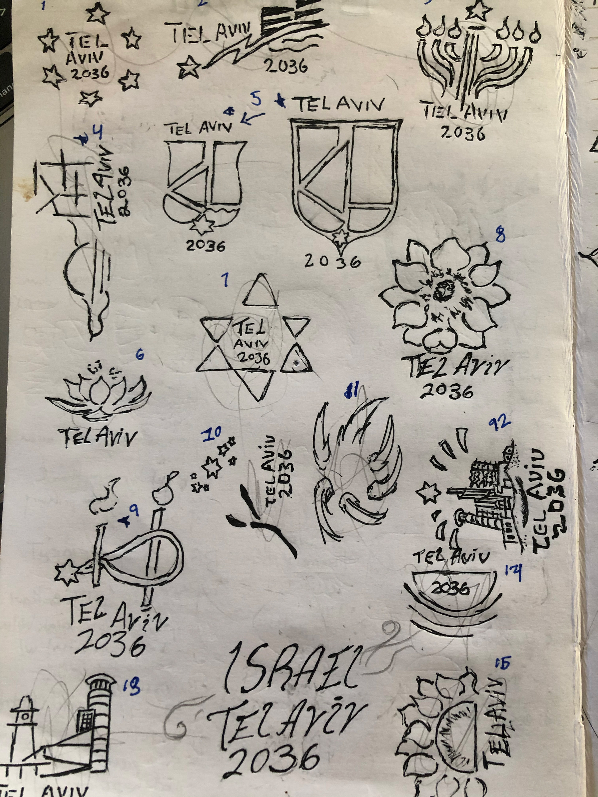
early sketches
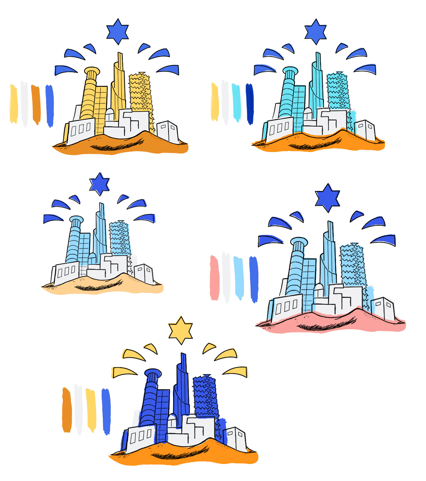
different color schemes
The whole process started with a lot of sketching. On the right you can see just a small selection of all the ideas I had sketched out before ultimately choosing 4 of the most promising ones and fleshing them out as roughs on the left.
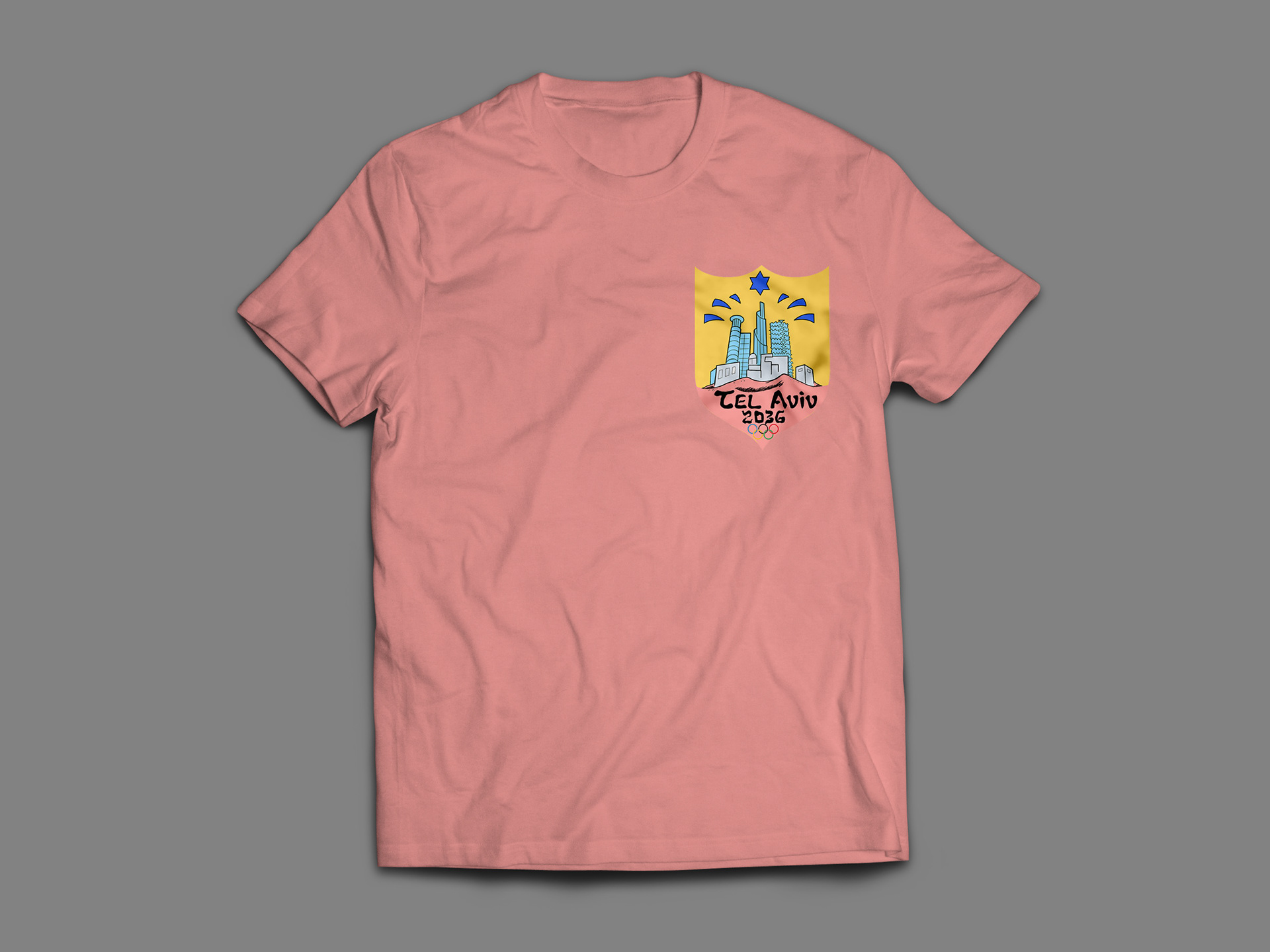
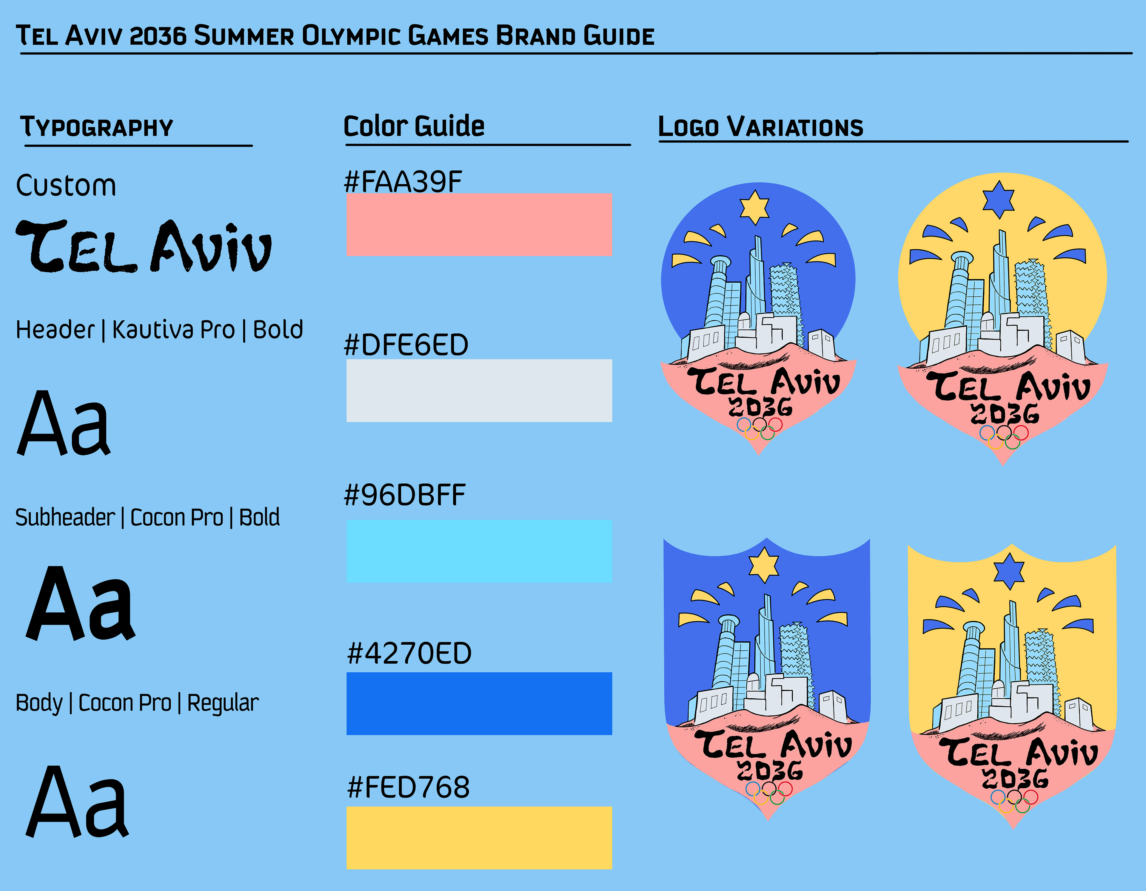
After landing on a design for my main logo, I went into exploring different color schemes that could portray the vibrancy of the city. I wanted to keep things bright and saturated and looked at a lot of oranges and yellows while keeping the historical blue the country keeps with. Eventually I went with the bright colors of pink, light blue, dark blue, and later added a yellow.
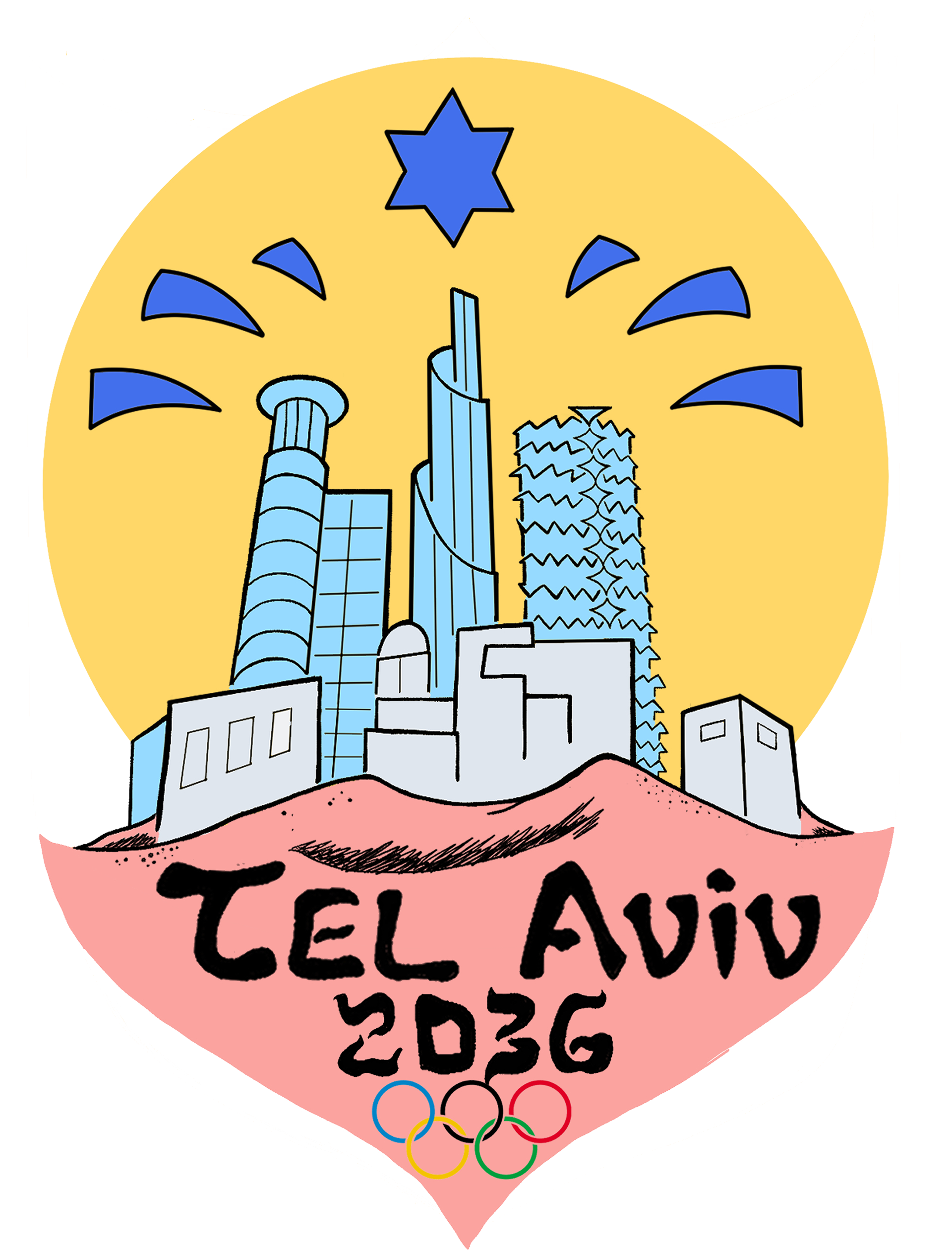
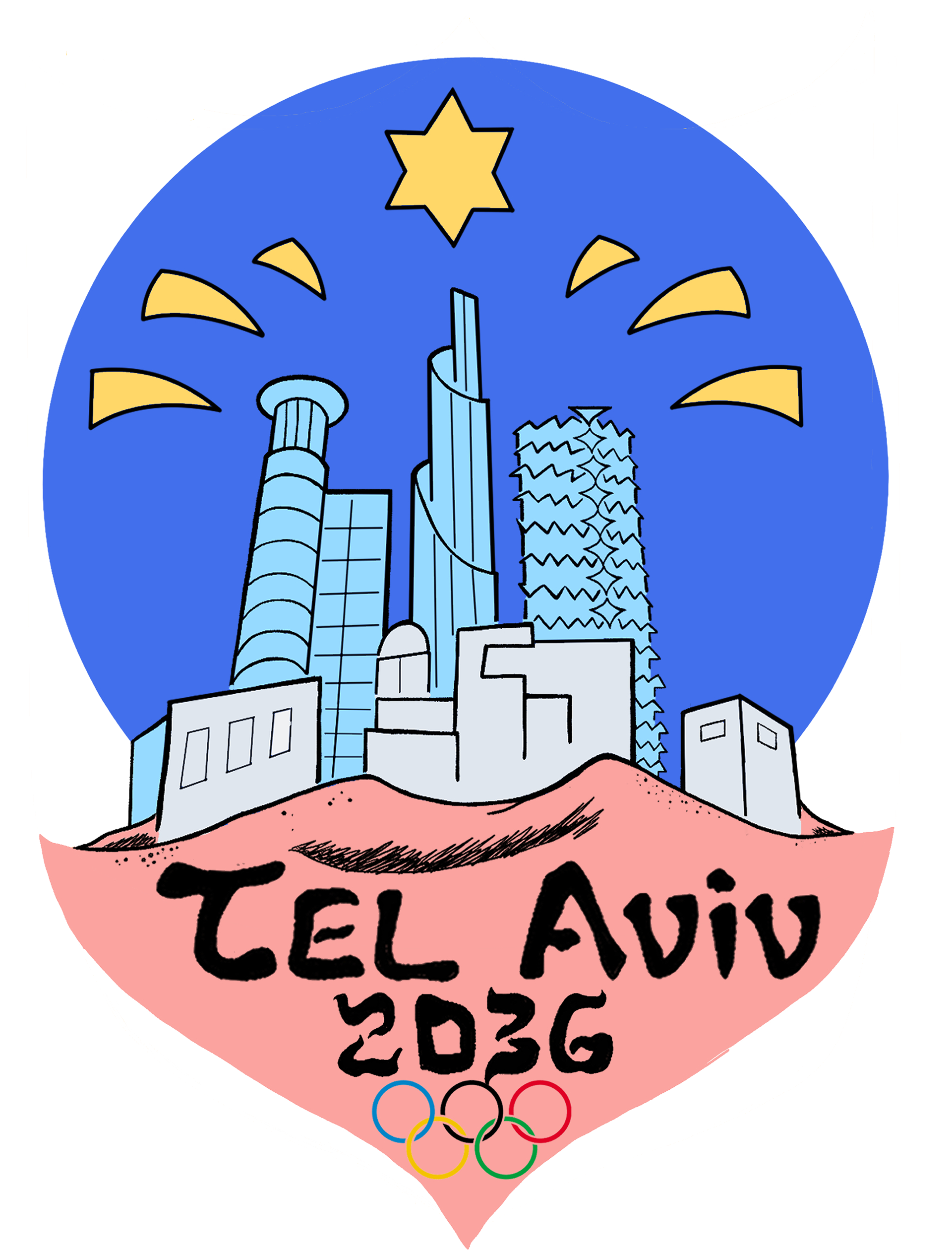
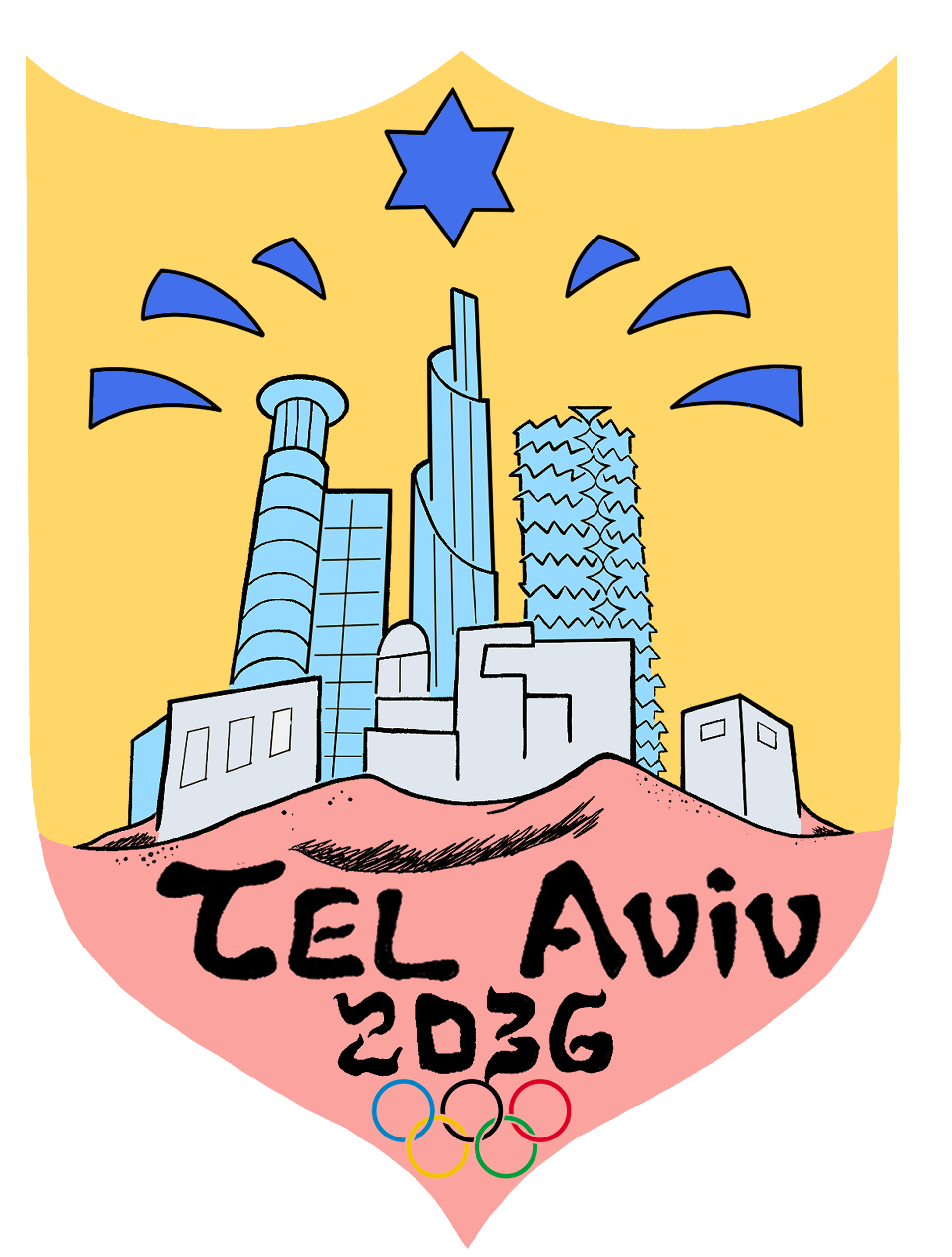
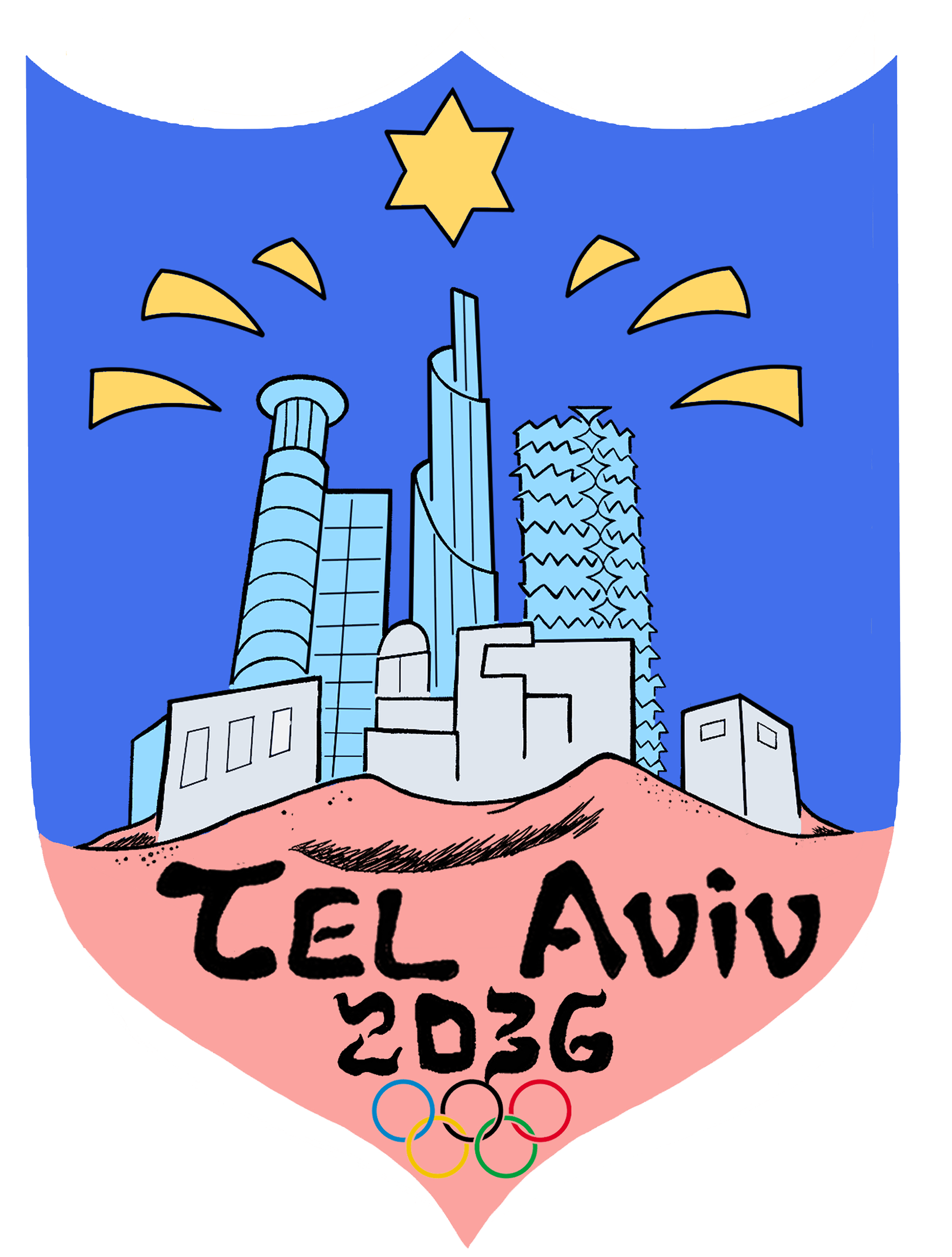
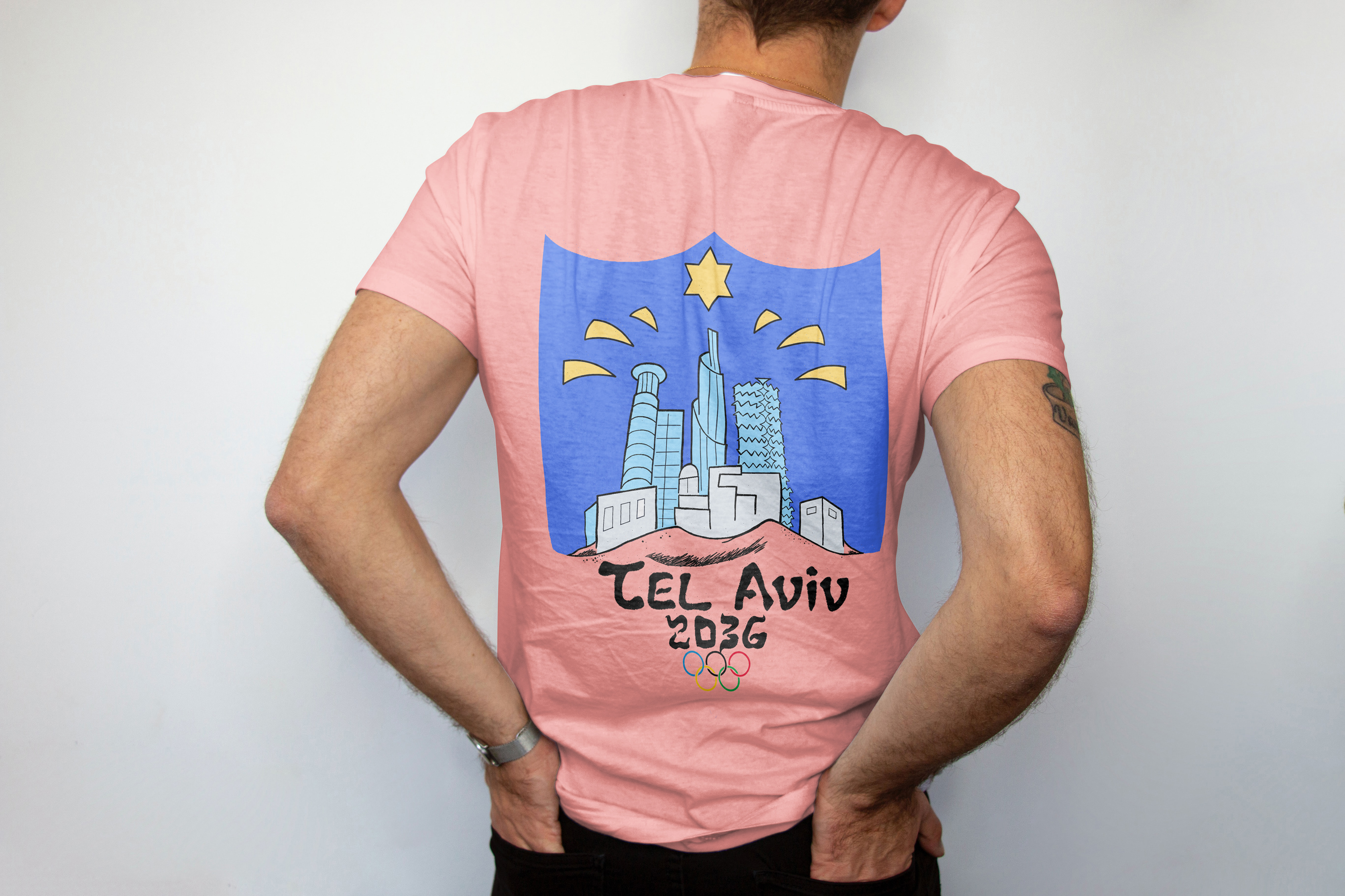
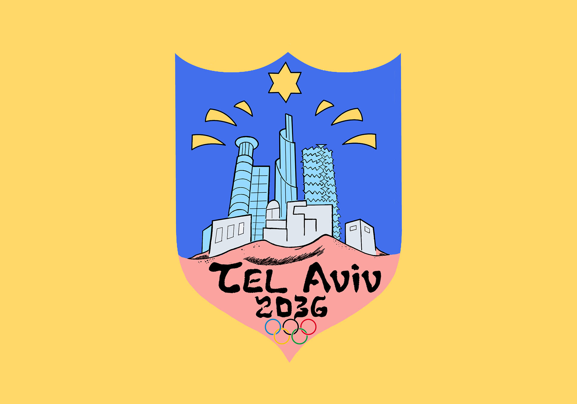
The main logo features the city as a living, partying entity that also shows its history and nods to its name. Tel Aviv roughly translates to “the hill of spring” with spring representing renewal and change (a big theme of the city) and the “hill” representing the past and the idea of a city that keeps rebuilding on top of itself, forever evolving. The logo showcases the city’s humble beginnings as sand dunes before building to the Bauhaus-inspired buildings of the 30’s and 40’s where the city got the nickname “the white city” and on top of it all remains the city as we see it today with some of its most popular skyscrapers shining bright with the star of David and a shield motif holding the city all together.
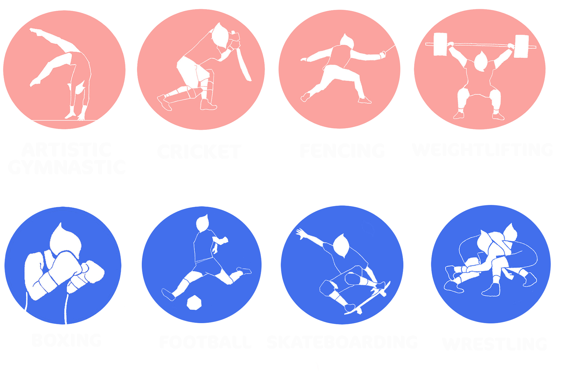
olympic pictograms
For my pictograms I kept them angular and geometric to showcase the sports energy and give them a modern look. I also used the head as a motif that calls to the Hebrew language as it was a symbol I consistently saw while researching.
All in all I think my design showcases a new, more realistic side of Tel Aviv that many people outside of Israel don’t see too often. With its bright colors, alive design, and nods to its roots, I believe this design for the 2036 Summer Olympic Games pleases all.
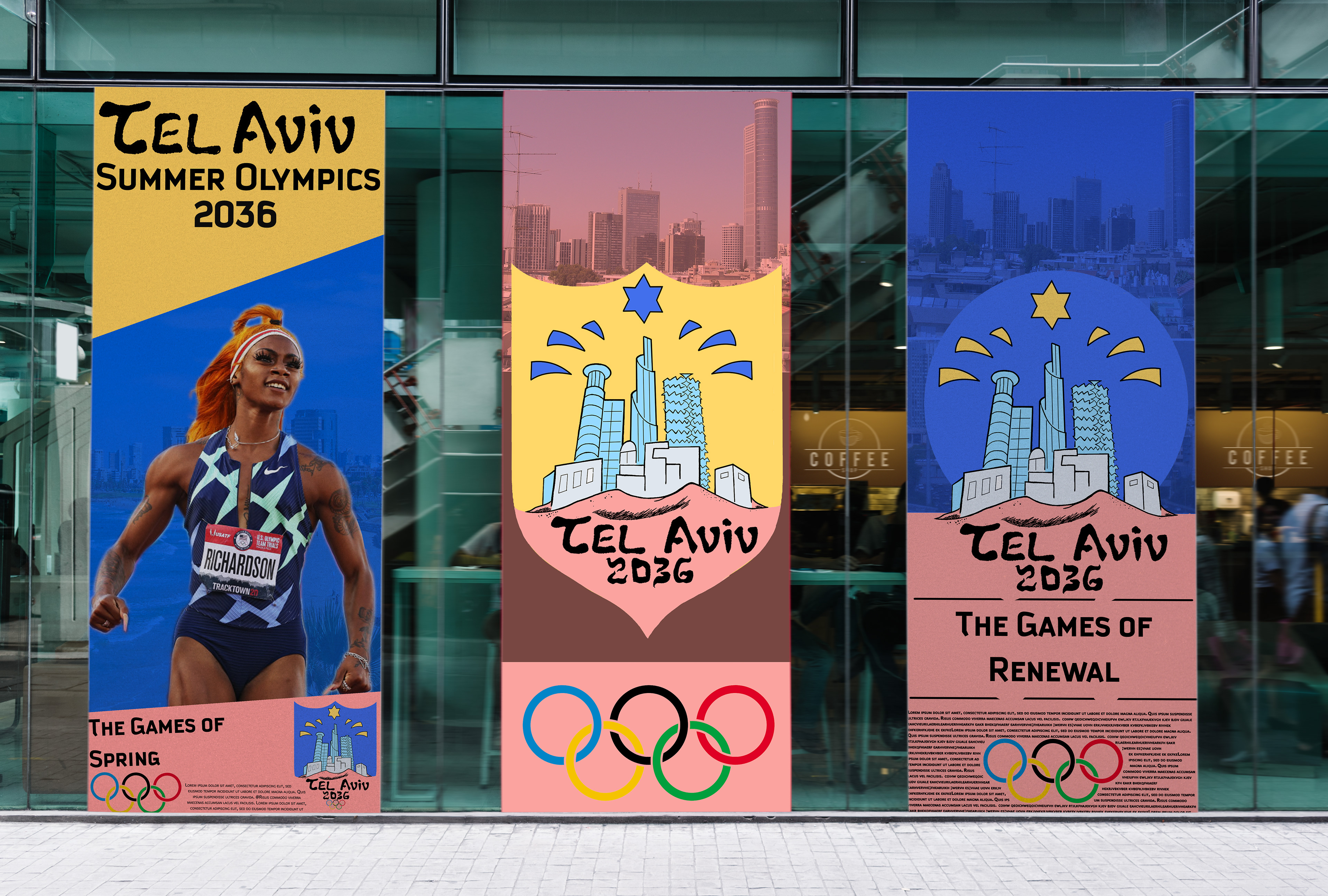
poster advertisment mockup