
Gus' has been a Charlotte staple for decades, but the restaurant has never really had a real brand identity. I sought out to fix this by revamping Gus' Sir Beef's image with a new logo, menu design, and advertising; all unified under a unique brand style.
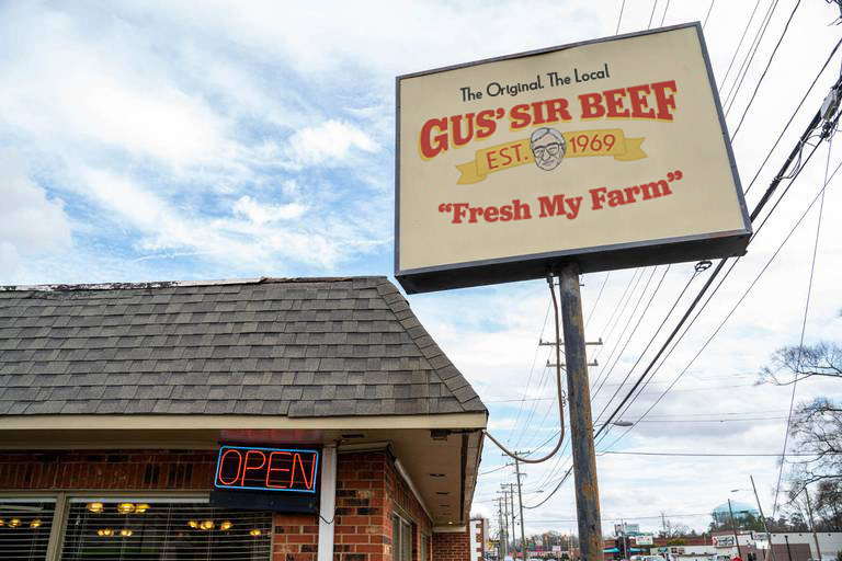
Billboard Mockup
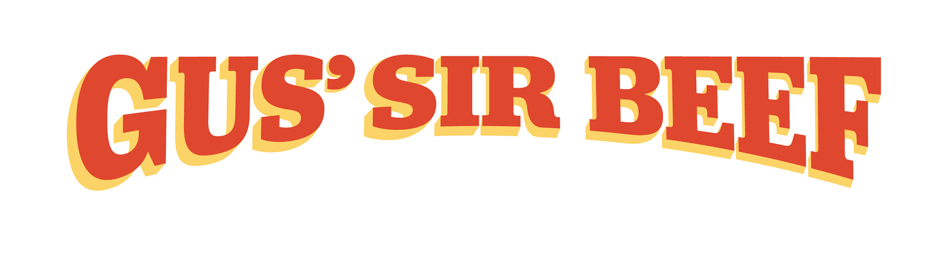
Primary word mark
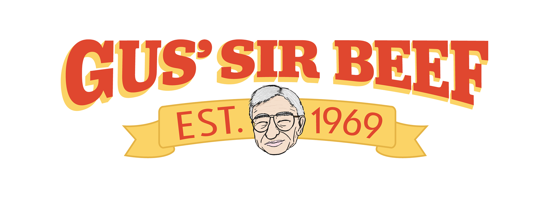
Secondary with icon
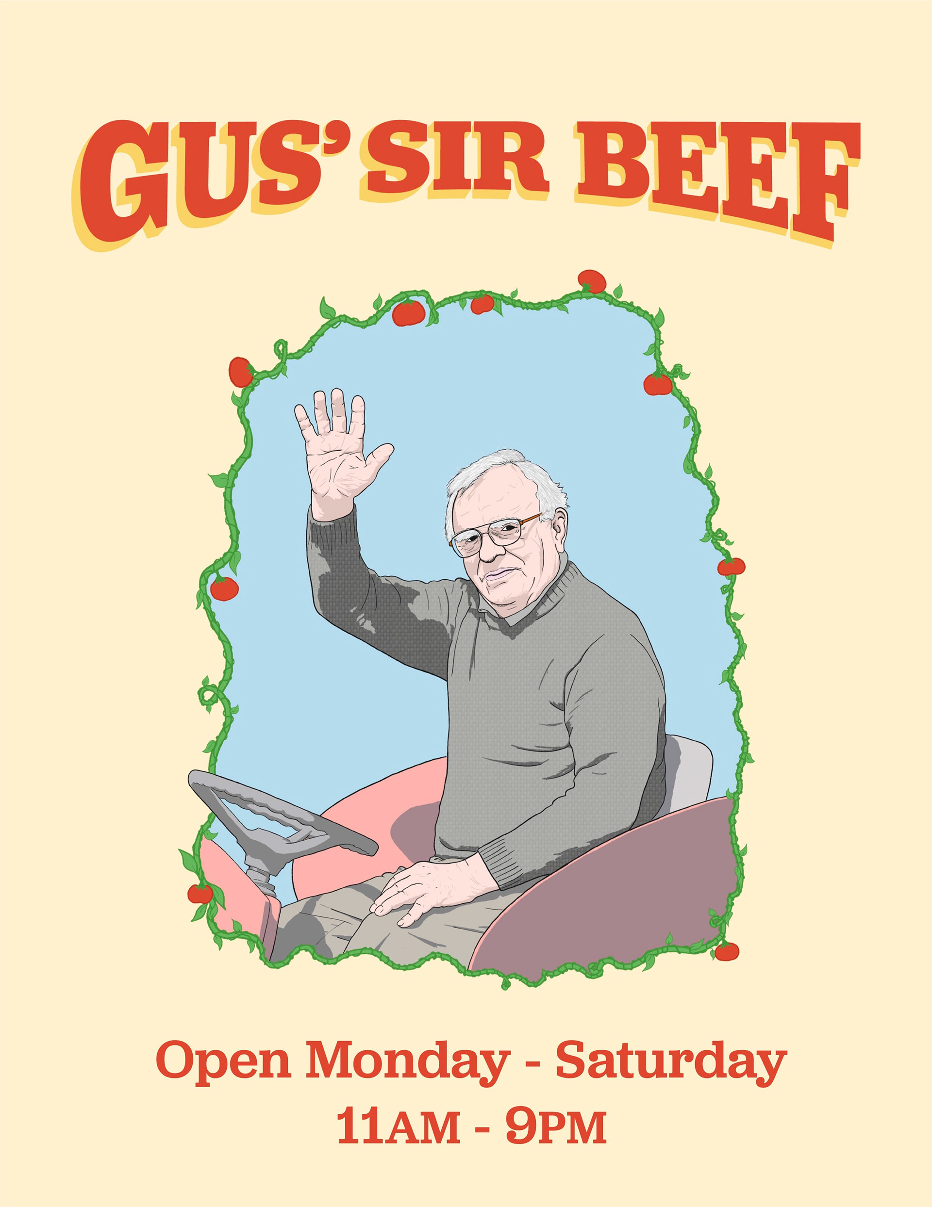
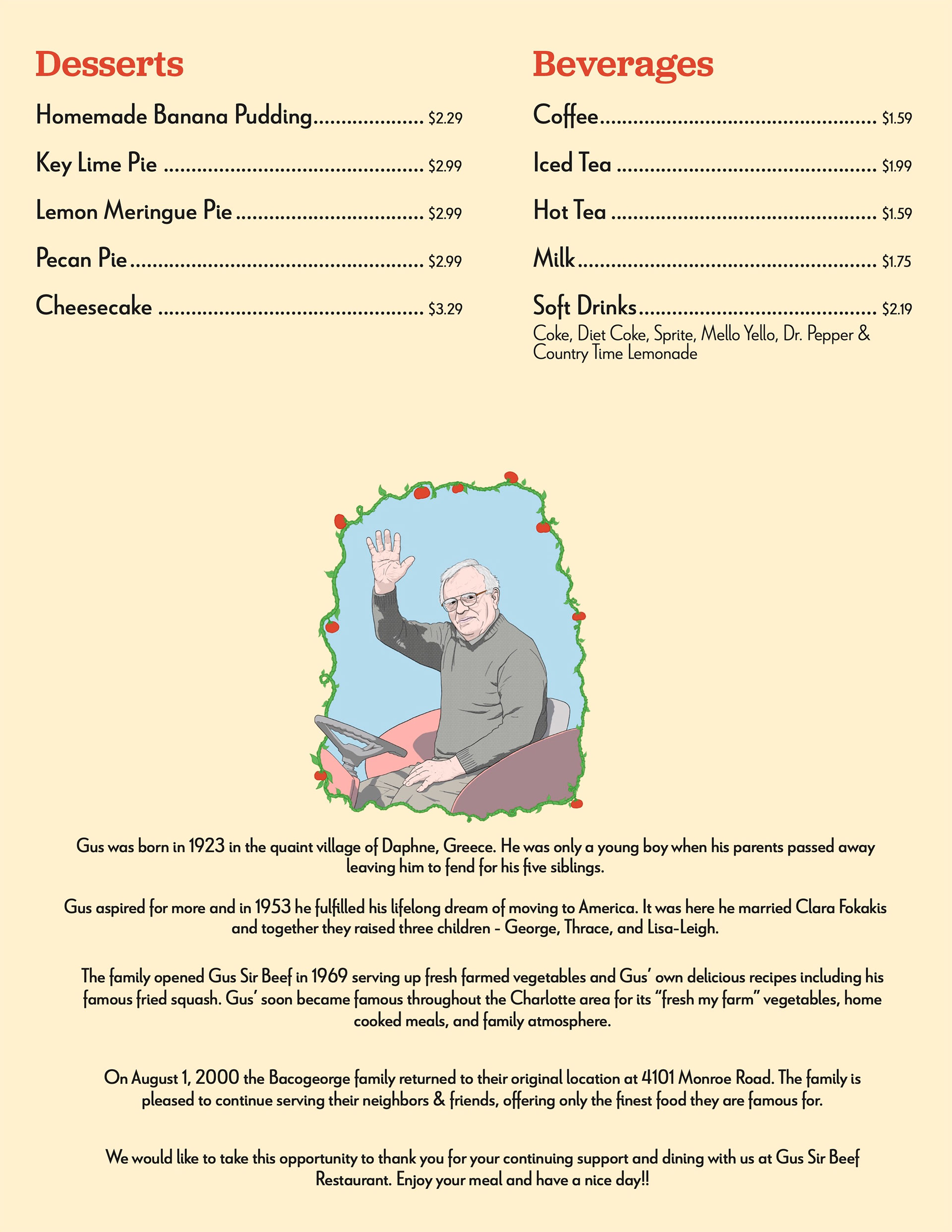
I leaned in heavily to a "vintage farmers market" look with the main logo to reflect the restaurants history and its farm fresh approach to food. I made an illustration of Gus for the icon since he has become a local icon and with his name in the restaurant, it only felt right.
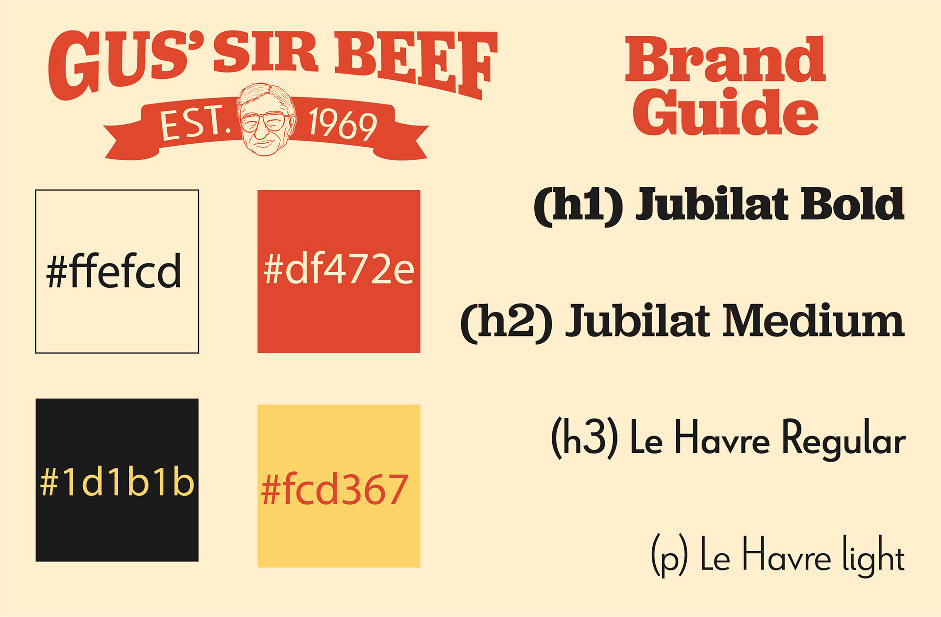
I picked out some soft and saturated brand colors to invoke that nostalgic feeling and did the same for my font choices going for the classic slab serif Jubilant paired with the sans serif Le Havre.
menu front
menu centerfold
menu back
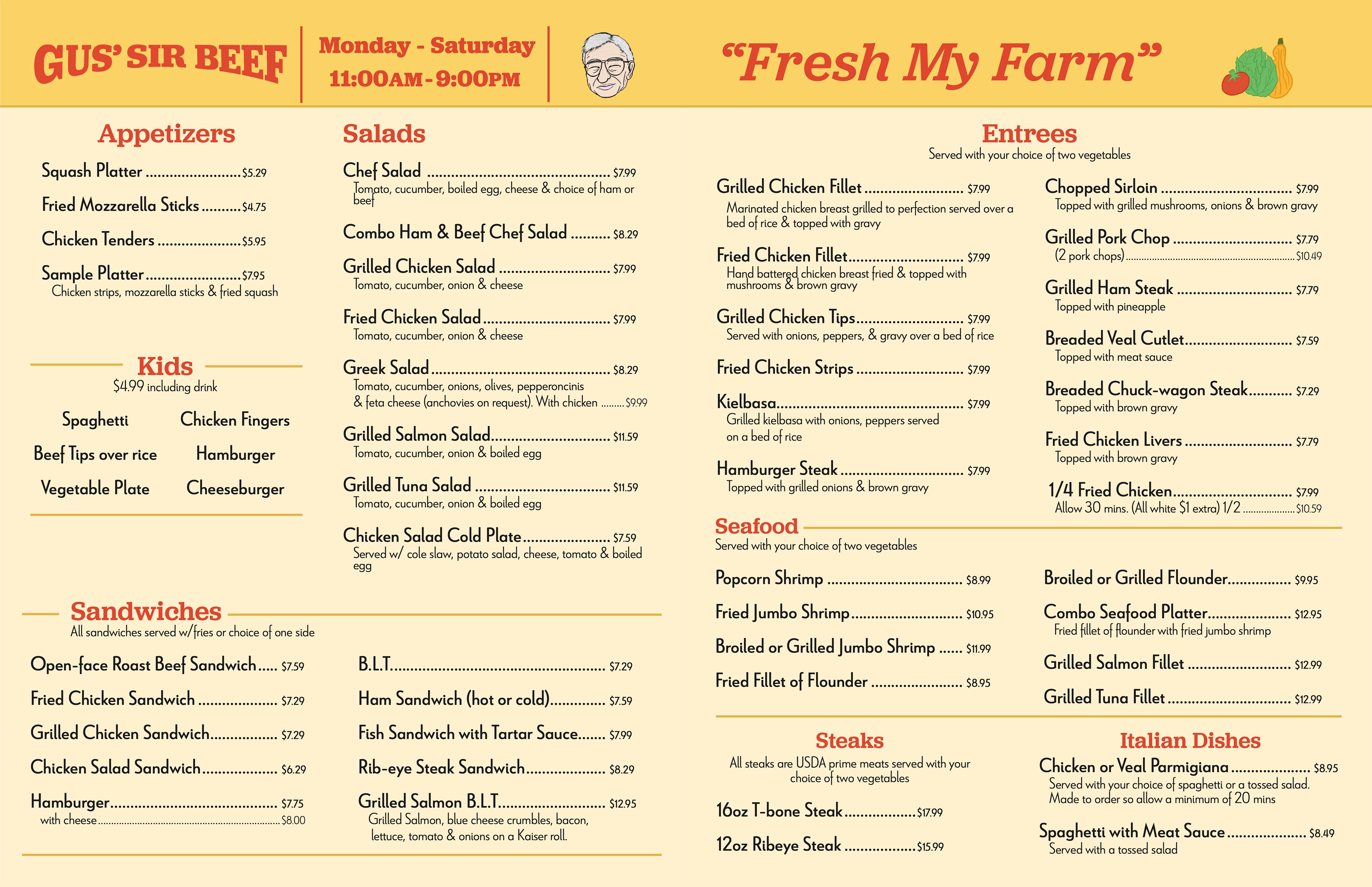
A goal of mine with the menu design was to keep it simple since the current design is a bit all over the place and so I cut the page limit down to 4 to make for a light booklet with an easy to follow flow. I did a mural like illustration of Gus for the front to replace the picture of the restaurant and pay respect to the late owner. I kept the back mostly the same as the restaurants history was my favorite part of the menu.
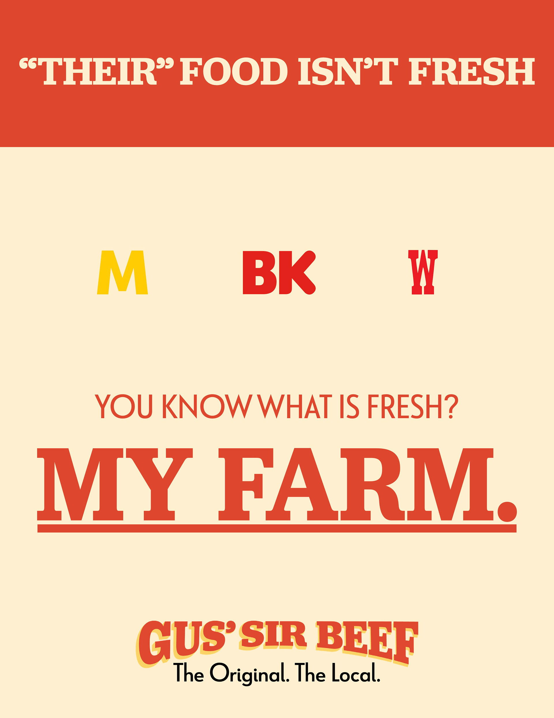
print ad (w/ graphic)
print ad (text only)
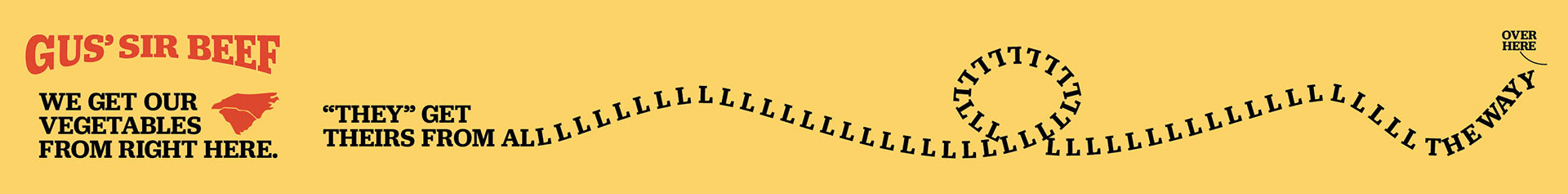
digital banner ad
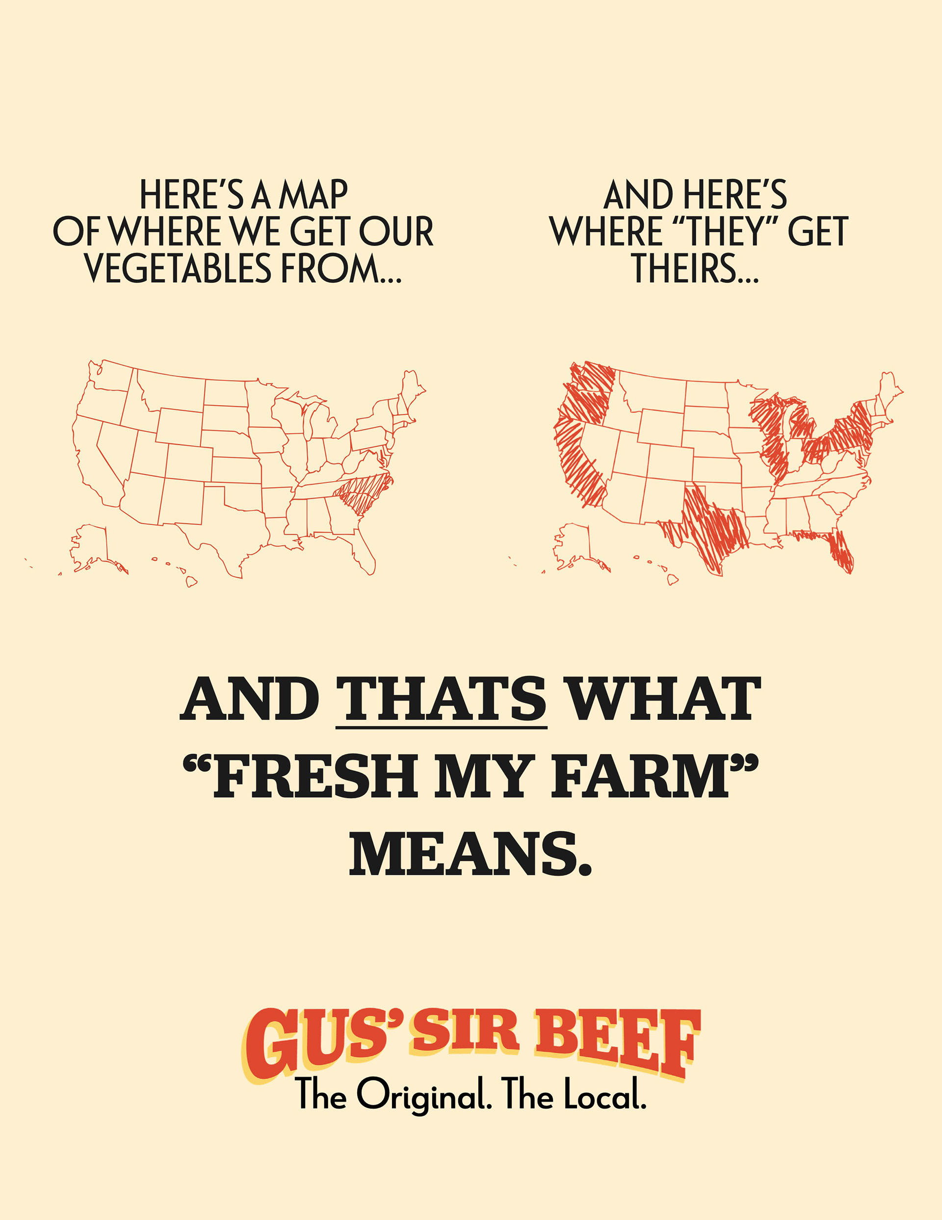
I had some fun with the advertising and went for a more aggressive style that aimed at fast food restaurants and hammered home the restaurants famous "fresh my farm" motto to show what makes Gus' Sir Beef stand out. The bold designs are made to capture the attention of anyone scrolling by and reward them for stopping to read.